• Please review our updated Terms and Rules here

The New Forums

Status
Not open for further replies.
Im logging onto the forum with my laptop for the first time. I just noticed the logon has "logon with facebook" Why is this a thing? ITs arbitrary, why isnt it logon with STEAM or Logon with Bank of America? Whats the difference? Cant we just have a logon to forum without relying on arbitrary things?
 
You can get to the last post in a thread by clicking on the little blue arrow icon under the name of the last responder, just to the right of the date. I was surprised to find that there's no text to click on to see the forum cateogries--you click on the little blue house at the top of the screen.

My general impression is that this new format wastes a lot of space and doesn't seem to improve operability. If "VERAULT" makes a post, that's all the information I need at that point--I don't need to see when he joined, or how many posts he's made or his facebook or twitter link--if any exists. No sense in promoting these players; they're big enough already.

I confess that I'm inclined to prefer text-only forum software more, such as Vanilla.
 
A need to get the most recent thead to appear first.

Late edit:

For example the continuously running "Craigs List" now has 157 pages. Now you have to click though all of the pages to see the latest entry. This is a major phoopaw.

On the top right of the page there is a box where you can jump to page 5 of 5 to get to the last page in that entry.
 
Can we get that line back that says "thread below this do not have new posts but have unread posts" or something like that. Sometimes you want to just see what is new and other times you want to read stuff that isn't new, but that you haven't read yet.
 
My general impression is that this new format wastes a lot of space and doesn't seem to improve operability. If "VERAULT" makes a post, that's all the information I need at that point--I don't need to see when he joined, or how many posts he's made or his facebook or twitter link--if any exists. No sense in promoting these players; they're big enough already.

I confess that I'm inclined to prefer text-only forum software more, such as Vanilla.
Vanilla is no panacea, but at least with a few local CSS overrides it can somewhat work in older browsers like SeaMonkey 1.1 and Firefox 2. It also tries to be "minimalist" but goes overboard by hiding the edit function behind a "gear menu" that only appears when you mouse over it. Also, the "activity stream" mis-feature is useless for anything other than attracting spam.

If vcfed wants to promote social media sites, they should be all-inclusive. Lets have buttons for "fap this post on 4chan", or "troll about this post on Soylentnews". Absurd? Not any more absurd than advertising for Facebook(R)(TM) and Twitter(R)(TM).
 
Vanilla is no panacea, but at least with a few local CSS overrides it can somewhat work in older browsers like SeaMonkey 1.1 and Firefox 2. It also tries to be "minimalist" but goes overboard by hiding the edit function behind a "gear menu" that only appears when you mouse over it. Also, the "activity stream" mis-feature is useless for anything other than attracting spam.

A forum that I frequent most often uses Vanilla 1.1.9. Things were simpler then.
 
You can select from a bunch of styles on the bottom of the screen.

That seems to be enabled only for administrators. We don't see that. This is what I see:

missing.png
 
You can get to the last post in a thread by clicking on the little blue arrow icon under the name of the last responder, just to the right of the date. I was surprised to find that there's no text to click on to see the forum cateogries--you click on the little blue house at the top of the screen.

My general impression is that this new format wastes a lot of space and doesn't seem to improve operability. If "VERAULT" makes a post, that's all the information I need at that point--I don't need to see when he joined, or how many posts he's made or his facebook or twitter link--if any exists. No sense in promoting these players; they're big enough already.

I confess that I'm inclined to prefer text-only forum software more, such as Vanilla.

I must not have something setup right as I don't see a blue arrow anywhere on the page. Should be last entry by default.
 
Last edited:
Okay, now that my frustration has calmed down a bit I'll try to be more constructive.
  • PLEASE remove the stupid script-based login, or at least create a separate login page that isn't script-based.
  • I still can't figure out how to bring back the old color scheme. Please add this feature, or if it's already there tell me how I can get to it.
  • Remove, or at least give us the option to remove the unnecessary Facebook and Twitter buttons that appear on EVERY. SINGLE. POST. I don't use any of those platforms and it's just an eyesore and a waste of space.


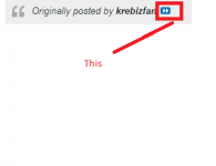
See the little double-arrow? That will get you to the last page.

Screenshot_2021-04-13_12-34-47.png

If you're talking about the arrow(s) in the upper right hand corner you would have to click 187 time if you wanted to see the latest thread on ongoing Craig's List. What am I missing?
 
Another annoying thing (but that is not the fault of the admins, but rather the developers of this forum software) is that you still have to press the "go to top" link in order to get to a link that allows you to get back to the forum listing for the (sub)forum you are currently reading. Sheesh, they could have fixed that at least.


If you're talking about the arrow(s) in the upper right hand corner you would have to click 187 time if you wanted to see the latest thread on ongoing Craig's List. What am I missing?

Next to the date of the last post under the name of the last poster is a small fast forward button that will move one to the last post in a thread. Not exactly discoverable.
 
Perhaps not everyone wants to run the AdBlock Social Media filter list I mentioned earlier, but it does strip the DorsZuck buttons.
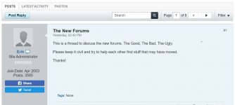
One thing I'm not seeing anymore is the poster's location.
Can't edit a post shortly afterwards as it thinks it's a spamming attempt.
And on my smaller screen phone, it's unusable.

For me so far, the headstrong exuberance of 'Change is good!' has collided head-on at high speed with the stoic realism of '...If it ain't broke' with the inevitably sad aftermath. But I have some hope some of those things will be rectified in time.
 
Next to the date of the last post under the name of the last poster is a small fast forward button that will move one to the last post in a thread. Not exactly discoverable.

You're going to have to draw me a picture because I don't see any fast forward button.
 
In forums I've administered in the past there is usually a "view as user" or some other functionality to allow the administrator to view the pages as though they are a standard user. I don't believe the admins are using this feature. Many of the suggestions being made I simply can't find (like changing themes from the bottom of the page).
 
You're going to have to draw me a picture because I don't see any fast forward button.

This is the easiest example of the close together double triangles which resemble the fast forward button. Click it on an actual post and jump to that post. On the new posts list, the last post is shown with that symbol.

ff button.png
 
Status
Not open for further replies.
Back
Top