Upcoming Events:
- VCF South West - June 14 - 16, Davidson-Gundy Alumni Center at University of Texas at Dallas
- VCF West - Aug 2 - 3, Computer History Museum, Mountain View, CA
- VCF Midwest - Sept 7 - 8 2024, Schaumburg, IL
- VCF SoCal - Mid February 2025, Location TBD, Southern CA
- VCF East - April 2025, Infoage Museum, Wall NJ
-
Please review our updated Terms and Rules here
You are using an out of date browser. It may not display this or other websites correctly.
You should upgrade or use an alternative browser.
You should upgrade or use an alternative browser.
New Forums nits
- Thread starter whartung
- Start date
NeXT
Veteran Member
This is something I absolutely support for these cosmetic options.I think the next step is to work on enabling individual selectable styles. The site supports it, and there's no way to please every one.
I also don't care for the green.The “like” button is back for me too.
I am afraid I agree with the poor choice of green as well. Same reason - readability. This also affects links (in the dropdown menu from the bell for example). These links are completely indistinguishable from the fixed text. I just happened to know they were there today!
Can we just unwind this modification please and put it back as it was rather than more “fiddling” - it was perfectly fine as it was...
Dave
I sort of liked the green in the header, it was a throw back to the old green phosphor displays. But I do admit the other green accents did not work for me, but I could not work out a combo that looked good enough to me, so it was mostly an experiment on my end.
Yeah, I am terrible at the design side of things, case and point the green combo, but it was an interesting learning experience.
Reverted back to the blue for now.
Yeah, I am terrible at the design side of things, case and point the green combo, but it was an interesting learning experience.
Reverted back to the blue for now.
Last edited:
VERAULT
Veteran Member
I just want to say how nice this new forum is working out. Even with the minor issues, which all seem to be pretty minor. This thing is night and day better than the Vbulletin steaming pile of dog Sh!t. Its much faster and more responsive. Good call on your choice for this!
smp
Veteran Member
Thanks sooo much for reverting to the blue color scheme!
smp
smp
daver2
10k Member
Thank you, I can read it again  !
!
No problem with you experimenting. I am sure that you have learnt some valuable things that you will put to good use presently.
Dave
No problem with you experimenting. I am sure that you have learnt some valuable things that you will put to good use presently.
Dave
I think this one might do, in .png format as attached here:
View attachment 1237673
Better! Nice work.
Although I have to agree with some others that the new green theme isn't as nice as before. The blue worked better... but maybe xenforo has something in teal/cyan, closer to the VCF color scheme?
I replaced it with that one, and I think it looks great.
Thanks again @VileR - unlike my color choices, the graphics look awesome now!
Any update on pictures in posts imported from old forum not working?
OK, here I contribute two data points.
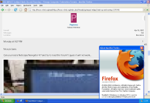
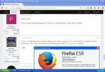
Firefox 2.0 (the most modern web browser for a lot of vintage plataforms, like Windows 98 and Solaris 8) only support TLS 1.0, and the forum's web server is requiring TLS 1.2. So Firefox 2.0 cannot reach the forum, unless using a TLS proxy. Even then, it renders the HTML/CSS badly, so it is not really usable for day to day use.

On the other hand, Firefox 52 is the latest Firefox for Windows XP, and this one works fine with the new forum:

Firefox 2.0 (the most modern web browser for a lot of vintage plataforms, like Windows 98 and Solaris 8) only support TLS 1.0, and the forum's web server is requiring TLS 1.2. So Firefox 2.0 cannot reach the forum, unless using a TLS proxy. Even then, it renders the HTML/CSS badly, so it is not really usable for day to day use.

On the other hand, Firefox 52 is the latest Firefox for Windows XP, and this one works fine with the new forum:

Jove
Experienced Member
Here is a way-out-there idea. Alternate read-only forum that is TLS 1.0 or even unencrypted HTTP accessible.
Absolutely no functions except deliver content. Not many are going to 'daily drive' the forums with an old machine, being able to render/read is more than we offer now and would get a lot of people through.
No, that is not me volunteering!
Absolutely no functions except deliver content. Not many are going to 'daily drive' the forums with an old machine, being able to render/read is more than we offer now and would get a lot of people through.
No, that is not me volunteering!
NeXT
Veteran Member
Here is a way-out-there idea. Alternate read-only forum that is TLS 1.0 or even unencrypted HTTP accessible.
Absolutely no functions except deliver content. Not many are going to 'daily drive' the forums with an old machine, being able to render/read is more than we offer now and would get a lot of people through.
No, that is not me volunteering!
There is likely people scoffing at this but I have seen it done. I know another forum that has a "lite" version of the site that is http friendly and strips out Web 2.0 specifically so people can browse, sign in and post with very old browsers. It became a bit of a self-challenge as he's gotten it working now on almost everything but early Mosaic builds due to how the browser broadcasts itself to the server.
There is a lot of scratch written code and because of how basic things needed to be in order for stuff like IE for Windows Mobile and Netscape to behave things like avatars, color themes or many formatting styles are omitted, but it works beautifully.
Jove
Experienced Member
I thought a read-only interface would help assuage the security concerns.
So I added some styles, you can choose between them at the bottom right left of the screen (in the footer, there might be some other places, but I am not sure about where).
The three are:
1. Default Style - The one we have been using since the start.
2. Green Phosphor - A Dark theme, with an emphasis on a very similar green from those green phosphor displays (I actually googled the RGB value for the green from those monitors).
3. Dark Style - Similar to the default, but but dark.
There maybe more added as we go, but I think these are good for now.
Last edited:
Jove
Experienced Member
The style selector was at the bottom left of my screen. Dark theme is appreciated and the green Phosphor is wonderful. Enough green to be retro, not so much that the screen seems to be green on black and naught else.
daver2
10k Member
Yep, bottom left of my screen also. It was a bit confusing to start with that the menu for changing the style then appeared at the top of the screen. But we got an excellent feature for a very, very minor nit report!
Liking the dark theme - that’s going on the iMac ASAP...
Nice job (yet again) Lutiana.
Dave
Liking the dark theme - that’s going on the iMac ASAP...
Nice job (yet again) Lutiana.
Dave
You can also change the style in your user preferences. There it's a drop down menu.
