vwestlife
Veteran Member
And here's my elaborate version, supporting loading fonts from files and unloading the TSR on request. It comes preloaded with the font from FreeGEM rather than the IBM ROM BIOS, because that was what I happened to have to hand (and I think it's a nicer font)
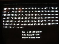
Here's what I get with CGAGFONT loaded. The font in graphics mode is better, but still not correct. I'll have to do some swapping around with the IBM CGA board in my 5150 to see if this happens will all CGA cards in my Packard Bell, or just the ATI.