• Please review our updated Terms and Rules here

PCjr Monitor Question

tempest

Veteran Member
Joined
Sep 16, 2014
Messages
930
Location
SE Michigan
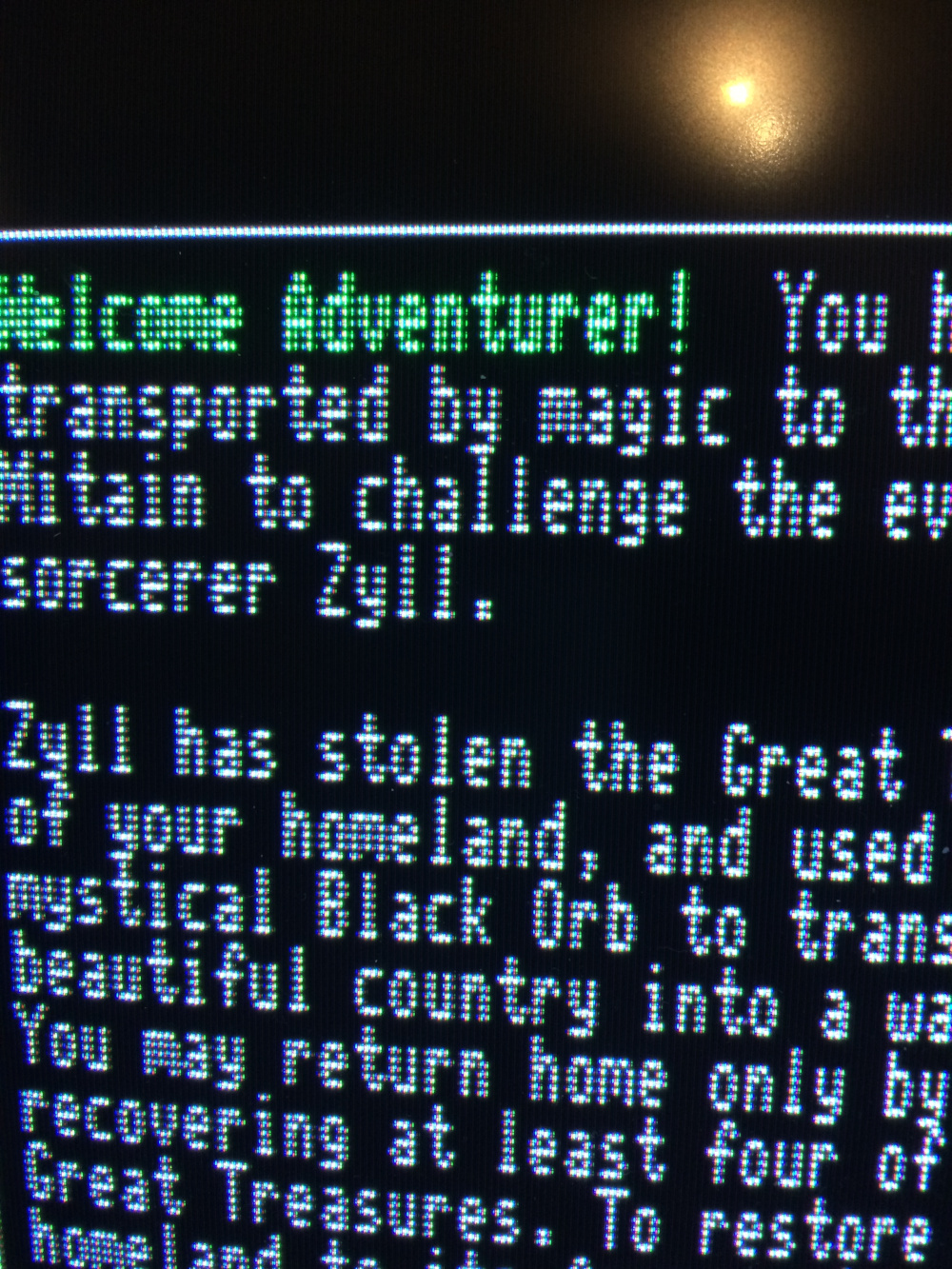
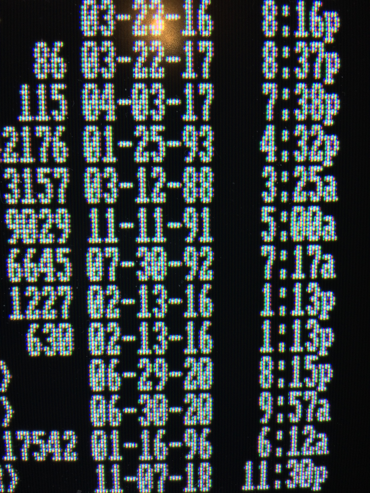
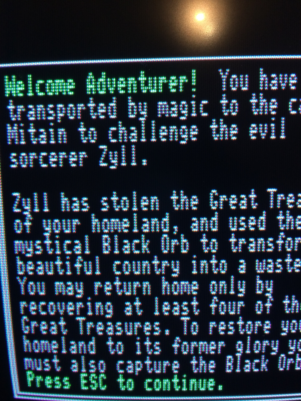
I've been having some issues with my IBM PCjr monitor. I had to reposition the yoke to fix some color and convergence issues, and I think I've almost got it, but I'm not sure. The text is now legible and when at look at the simple test pattern the internal diagnostics provide the lines are a solid color again. However the text is a little fuzzy to my eyes. I don't know if this is because the PCjr monitor isn't the greatest (it's really an IBM CGA monitor) or if my convergences are still off. I want to say that it's the latter, but maybe someone here can help me determine that for sure. Here's a close up picture I took up the text for Zyll, as you can see the text isn't 100% white, but as I said I don't know if this is normal or not for a PCjr monitor.

zylltext.jpg


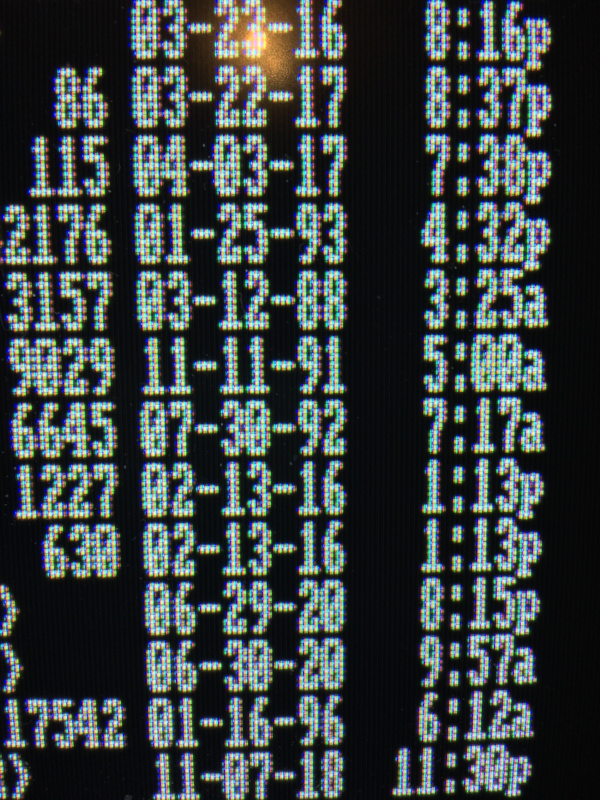
Here's the same picture zoomed out a bit:

zylltext2.jpg


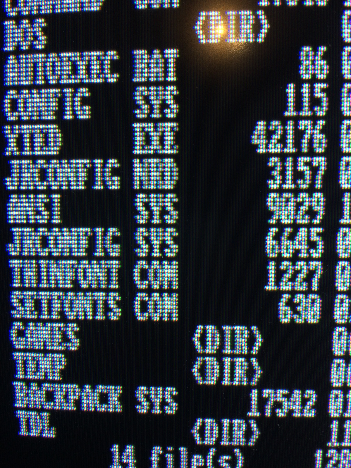
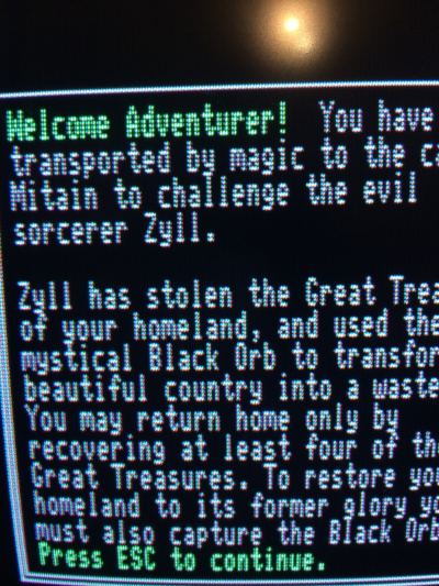
And zoomed out a bit more:

zylltext3.jpg
 
Looks like the convergence needs tweaking on your monitor. Has the image size changed at all (would point to a power supply issue). Has the monitor been handled roughly lately?

Adjusting convergence with the proper test pattern is fairly straightforward, albeit tedious. Looks to be mostly confined to the red gun.
 
Has the monitor been handled roughly lately?

Adjusting convergence with the proper test pattern is fairly straightforward, albeit tedious. Looks to be mostly confined to the red gun.

No to the power supply issue, but yes I've messing with it trying to straighten out the picture. How would I go about adjusting the red gun? Is that with the second set of convergence magnets or does the yoke need more adjusting?

Is there a good test pattern generator program I can use?
 
I found Trixter's CGA Compatibility program which helps a bit. One thing I noticed is that when the background for the main page is displayed it seems to 'bow' a bit in the center. Could that be the cause of my issues? You can't see it so much in these pictures, but it's noticeable in person. I tried moving the yoke a bit to see if I could fix the bowing, but it didn't seem to change. I'm not sure I want to keep messing with it and completely break things.


cga.jpg


cga2.jpg
 
That's called "pincushion distortion" and can be corrected. There is usually a whole array of magnets on the yoke along with other controls. Your best bet is to find the service manual for the monitor and follow their alignment procedure.
 
Those last two screenshots make the clarity problem even more apparent, since some vertical lines are fuzzier than others (for instance the "C"s in "CGA" vs. "Compatibility").

What machine/graphics board are you running this on? The font has single-dot strokes, unlike the CGA/PCjr's double-dot font. Someone correct me if I'm wrong, but IIRC the Jr. monitor had a larger dot pitch than the 5153, and perhaps that's at least part of the issue here... since a double-dot font would make it much less of an issue.
 
What machine/graphics board are you running this on? The font has single-dot strokes, unlike the CGA/PCjr's double-dot font. Someone correct me if I'm wrong, but IIRC the Jr. monitor had a larger dot pitch than the 5153, and perhaps that's at least part of the issue here... since a double-dot font would make it much less of an issue.

There was a thin-font modification for the PCjr, and if this is the PCjr I'm thinking of, I saw Tempest buy it at VCFMW about 6 years ago. It also has a 9.54MHz mod :-O

The PCjr monitor has the second worst dot pitch of all my TTL color monitors; it's something like 0.43. Some numbers for comparison: http://www.vcfed.org/forum/showthre...-High-Resolution-Graphics&p=104283#post104283

Yes I have the Thin-Font chip in my PCjr. I can set it to the wider one and see if that helps.

No it's not the one you're thinking of, I got my PCjr 15+ years ago and it doesn't have any speed mod.
 
Turning the ThinFont to 'Normal' actually makes things worse. The convergence blurriness is even more apparent.
 
What's the best test pattern for trying to fix the convergence? Should I muck with adjusting the yoke again or should I leave that alone?
 
What's the best test pattern for trying to fix the convergence? Should I muck with adjusting the yoke again or should I leave that alone?

The RGB crosshatch pattern in my CGA tester is probably best for fixing convergence, as it displays solid white grid lines on a black background, where bleed would be most obvious.
 
I think I'm ready to admit defeat. No matter what I do I can't get everything to line up correctly. I can get it to 'usable' but it's still not the best. Here are the results of my latest attempts. I just don't know what else to do, I've adjusted the yoke six ways from sunday, the magnets are back to their original spots (examining the glue trail and lining everything up was fun), but it's always off.

zylltext4.jpg


zylltext5.jpg
 
BTW does anyone know what that knob is below the focus in the back of the monitor? I cant read the label on it because a piece of metal is in the way. There's no convergence knob in the PCjr monitor is there?
 
That other knob seems to have something to do with the white levels. Not something I need unfortunately.
 
Reverting back to the regular font is recommended; the thin font was only intended for use on monochrome and/or high res/quality monitors. It will make your issues less noticeable.
 
One thing I noticed is that the top center has a bit of bowing and so does the top right of the image. Could that mean the yoke still needs adjusting?

Reverting back to the regular font is recommended; the thin font was only intended for use on monochrome and/or high res/quality monitors. It will make your issues less noticeable.

Here's what the 'normal' font looks like.

normalfont3.jpg

normalfont1.jpg

normalfont2.jpg
 
Back
Top