• Please review our updated Terms and Rules here

PCjr Monitor Question

See section 7 here.

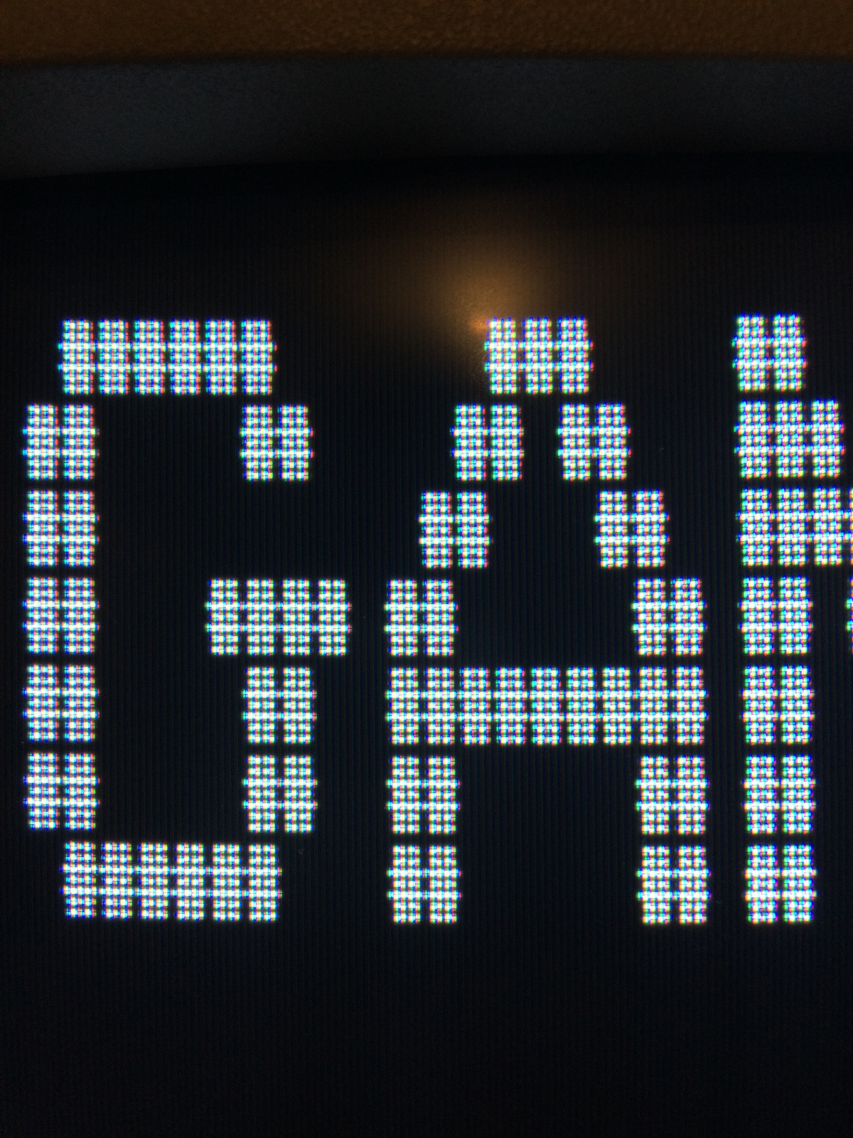
Color CRT adjustment is enough to drive one to drink.

Given that this is a coarse-pitch shadow-mask monitor, a certain amount of color fringing is unavoidable.

I think you might be right. I may give it one more go and just call it. Even if it still is off I can't seem to make it any better than this.
 
I think this is as good as it's going to get. I honestly wish I could remember how clear it looked before I mucked with everything. I'm starting to think that maybe it was always this fuzzy because of the low dot pitch. Maybe I'm perusing something that doesn't exist?


fixed1.jpg

fixed2.jpg

fixed3.jpg
 
When CGA was a new thing, I couldn't stand the look of alpha mode on it. I opted for MDA right off the bat, even though I had a spare color monitor. Note also, that the people who redid the 5150 display for the APL character set dismissed the CGA precisely for its lack of readability.

So you may not get better than this. :(
 
I'm honestly trying to decide if I want the PCjr out or my 5150 with an EGA Wonder card and 5151 monitor. It's cool being able to display CGA/Hercules/EGA on a 5151 but some of the details really do get washed out. For example, I could barely see the clover in KQ1 as it was 'just' a different shade of green than the background grass. Then again unless you're playing a game that uses PCjr/Tandy graphics games of the era look like crap with CGA. CGA on monochrome is so much better.
 
There is some small amount of fringing on a "perfect" PCjr monitor (which I have). I still content that the thin font makes your problems worse, not better (the vertical lines don't always seem even in your shots).

For your EGA Wonder + 5151, run the latest CGA Compatibility Tester; I added a "monochrome CGA" luminance bars section that you can use to try to get all 16 shades distinct from each other.

My problem with the regular font is that it looks fuzzier to me. Maybe I'm just so used to the thin font now? Or could it be that the 'normal' font in the EPROM is different than the one that came with the PCjr? I honestly never compared them or have any way to doing that at the moment since the chip they replaced with the mod wasn't included.

How would you adjust the 'colors' on the 5151? I didn't think there was any sort of adjustment possible.
 
Here are some examples of the 'normal' font provided by the mod. Notice how you can't even see the lines in the #, it's almost one giant blob.

thick1.jpg


thick2.jpg


Here it is zoomed out a little:

thick3.jpg
 
Here are some examples of the 'normal' font provided by the mod. Notice how you can't even see the lines in the #, it's almost one giant blob.

That's almost par for the course for a PCjr monitor. I'll set one up tonight and take a photo.

How would you adjust the 'colors' on the 5151? I didn't think there was any sort of adjustment possible.

Brightness and contrast, to get them as linear/distinct as possible from one another.
 
That's almost par for the course for a PCjr monitor. I'll set one up tonight and take a photo.
Maybe I'm just being too picky. I wish I had 'before' pictures to compare to. I guess y biggest gripe is the green/magenta fringing you can see on the text. Of course being an Apple II guy you'd think I'd be used to that.


Brightness and contrast, to get them as linear/distinct as possible from one another.

Ah ok. I think I'll look into that.
 
If you were to ask me, that doesn't look exactly terrible for a peanut monitor. I have 1 in the garage, but don't think I have anything operational to drive it at the moment.

Agreed. For most CGA monitors that I've seen, it actually looks pretty decent.
 
If you were to ask me, that doesn't look exactly terrible for a peanut monitor. I have 1 in the garage, but don't think I have anything operational to drive it at the moment.

Maybe it is ok after all and I need to just let it go. Games look ok, it's just the text that looks a little off to me.
 
That's almost par for the course for a PCjr monitor. I'll set one up tonight and take a photo.

Better late than never? I calibrated one of my best PCjr monitors for a recent video I did, and finally took some shots for you with one of my best lenses:

P1100228.png
P1100229.png
P1100230.png
P1100231.png

The last one has the hash (#) marks you were miffed you couldn't see clearly. Neither can I, but it has a 0.43 dot pitch, so of course fine detail has no chance of showing up.

In other words, I think your monitor's performance is par for the course.

Look at the bright side: 2x2 dither patterns get free blending and anti-aliasing ;-)
 
Back
Top