• Please review our updated Terms and Rules here

The move is complete, but the tweaking has only just begun

Lutiana

Administrator
Staff member
Joined
Mar 26, 2009
Messages
3,297
Location
Dublin, CA USA
Welcome to the new forums!

Some things we are working on right out of the gate:

  • Some members are being moderated, when they really should be. No idea why this is happening, but it has something to do with the permissions, we are working on it, as well as approving your posts as fast as we can.
  • The site needs a ton of customization from a color and graphics stand point. The "Xenforo" logo at the top needs to be replaced as an example, the color scheme as another. But we are muddling through it, our only ask is that you have some patience with us.
  • Permissions need a ton of work. This is a very complex beast to tackle, and they work in some counter intuitive ways, so we will approach this one slowly.

One thing you may have noticed is that signatures should be re-enabled, the avatars are now square, the trophy system has been turned off. locations and post counts are back under people's names and member titles have been tweaked slightly:
  • 0 - 9 = New Member (posts are moderated)
  • 11 - 49 = Member
  • 51 - 499 = Experienced Member
  • 500 - 9.9k = Veteran Member
  • 10k - 49k = 10k Member
  • 50k+ = 50k Member

Way more to come, but please post about any ideas/issues you have so we can work on them, prioritize them and hopefully get it all done in time.
 
>>> But we are muddling through it, our only ask is that you have some patience with us.

The new forum has been up for less than 24 hours. Ok, there have been a few “teething troubles” that we all expected - but the key thing is that the admins have sorted the important ones out very quickly.

In my opinion, I have a much more usable forum now than I did 24 hours ago all thanks to the effort you guys have put in!

The only immediate suggestion I would have (if you haven’t already done it) is for an admin to create a new “dummy” user to ensure that someone’s first “experience” of this newly joined forum is a good one from the start.

Have a well-earned glass of wine (substitute for your tipple of choice)!

Ok, back to posting about vintage computers on our much improved forum...

Dave
 
Hallo tank you for the migration, basically this forum software seems to be much better than the old one and it looks like you still have a lot of work tith customization. One first step I would love to see if you remove that biug big large long long banner, this is the thing disturbs me most, always scrolling down to get the contents,
 
If it is the red banner that I am thinking of, click the cross in the top right-hand corner and it goes away forever.

Dave
 
Should have posted this here: Can we bring back the date/year members joined? It really stinks to see that gone.
 
The forum looks nicer than before, and it feels more snappy.

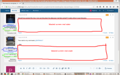
There is a "problem" with wasted screen real state, big chunks of which are currently filled with useless white space, like in this screenshot:

2021-12-26_new-VCF-forum-Xenforo_.png

Also, the "user titles" (A) I find useless, for we already can see the much richer info: date of joining and number of messages posted (B). Therefore I would suppress those "user titles".

And lastly, if the left most column could be enlarged in width, many "locations" could fit in a single line and not take two or three (as in the screenshot above).
 
Last edited:
The forum looks nicer than before, and it feels more snappy.

There is a "problem" with wasted screen real state, big chunks of which are currently filled with useless white space, like in this screenshot:

View attachment 1237041

Also, the "user titles" (A) I find useless, for we already can see the much richer info: date of joining and number of messages posted (B). Therefore I would suppress those "user titles".

And lastly, if the left most column could be enlarged in width, many "locations" could fit in a single line and not take two or three (as in the screenshot above).

The 'wasted space' is likely the result of a minimum height per post caused by the user name/avatar/details on the left. I can't see how that could be reduced without removing some of those items. And if that could be done, threads would end up looking very cramped and hard to read/follow.

The user titles are mostly unnecessary, except for those cases where a post is from someone such as 'ajacocks' who I can now see, thanks to this feature, is a VCF MA Committee Member - a detail I don't think I recall seeing before.

Personally, I like this format a whole lot. It tells me what I want to know, and gives me a screen I can read and follow with ease, rather than the jumble there was before.
 
I agree things are much more responsive, even snappy (as another user has mentioned).

One thing I can't find is the place to click to get you to the first unread post in a thread. Has that gone away or am I just blind?

Thanks.
 
"Jump to new" in the upper right corner. But it also does that automatically when opening a thread.
 
Here comes the Complain Train with your conductor, "Stick up his butt" NeXT.
Sorry Lutiana. You probably feared for Monday morning because of this. I really don't like being a d%*k but it drives me nuts when things are changed for few reasons beyond "it's old", then said group pisses off and I guess it's you, the fire and a single halon extinguisher.

I've been holding back on this until after your original planned downtime.....but there's the first problem. You told us what weekend you wanted. We gave you the weekend, pretty much because the first upgrade was a tire fire that was still burning away and we'd rather let the admin team do it right the second time if they were not in a rush. It was done by Saturday morning. Nothing was configured, nothing was debugged. It went live with a few suggestions from the preview applied and judging from the other replies in here some minor things have already been fixed.

BUT Since I don't see a buglist anywhere so far...
-I have PM notifications for messages that are YEARS old and I can't mark them as read
-The subforums are no longer hidden but they are all super nested so you can't actually what is going on in any of them other than "this was the last post in this giant pile of subforums" That isn't what that feature was designed for.
-Post WYSIWYG is again on by default but that I can tell in the user settings there is no control for it.
-The site theme hasn't been deployed, assuming someone developed that before the transition. Otherwise I'm insulting the theme as-is.
-The blog section is better, albeit the Latest Post portion kinda crunches it vertically. I can kinda understand this because new forum software isn't setup for blogs.
-Again there's several inches of padding on either side of the forum that is being unused. This might be something that cannot be changed with modern forum software but good god it's wasteful.
-I see we no longer have custom smilies in favor of the standard Emoji set. Nobody has really used the custom ones for many years now but oh well...

I'm still comparing features and settings compared to the KLOV forum so I'll be at this for a few more hours. One thing I WILL say thank you for is retaining square avatars.
 
Last edited:
but it drives me nuts when things are changed for few reasons beyond "it's old"

We moved from vBulletin because it had become a garbage platform, with an openly hostile dev team and obvious signs of lack of development. It also had some serious performance issues, which meant moderating it, among other things, was like pulling teeth. The PM system issues we were seeing were not solvable, and not a single person on the vBulletin dev team could not have cared less about it. So I do take exception to your stating me moved simply because "its old" and it shows a rather flawed understanding of what was going on.

BUT Since I don't see a buglist anywhere so far...
-I have PM notifications for messages that are YEARS old and I can't mark them as read

Yes, that is definitely an artifact of the data transfer. I too had the same issue, marking them read in the conversations section (selecting them all, scrolling to the bottom and selecting "Mark as read") did not seem to work for me, but since I only had a dozen or so, I simply went through and click on them. Not ideal, but it worked, and it is a one time thing that you would need to do.

-The subforums are no longer hidden but they are all super nested so you can't actually what is going on in any of them other than "this was the last post in this giant pile of subforums" That isn't what that feature was designed for.

This is an issue that I am actively working on. I have some ideas on how to fix it. It is, to some degree, an artifact of switching platforms that work just slightly different than each other. It also has to do with a ton of legacy setup that I am slowly unwinding. There will be more on this in the coming days.

-Post WYSIWYG is again on by default but that I can tell in the user settings there is no control for it.

Can you please elaborate on this. I don't understand your ask/complaint.

-The site theme hasn't been deployed, assuming someone developed that before the transition. Otherwise I'm insulting the theme as-is.

There are no "themes" that I can find in Xenforo, but there are ways to tweak the style. Which we will be doing slowly over time. None of the admin team are Xenforo experts nor are we experienced UI designers, so to expect that we would have whipped out a completely customized and working site in 3 days flat is a very unreasonable expectation. I have been clear in all of my communication that this process will take time, and that we plan to do it slowly in order to minimize issues. Our number one focus is a working, reliable platform, making it look nice is just not as important right now.

-The blog section is better, albeit the Latest Post portion kinda crunches it vertically. I can kinda understand this because new forum software isn't setup for blogs.

There will be work on this in the future. Xenforo has a paid addon specifically designed for content sharing and blogging, and we will investigate at some point soon.

-Again there's several inches of padding on either side of the forum that is being unused. This might be something that cannot be changed with modern forum software but good god it's wasteful.

It can almost certainly be changed, but again, no one on the admin team is a Xenforo expert and as far as I know none of us are design experts either. We are learning this as we go.

-I see we no longer have custom smilies in favor of the standard Emoji set. Nobody has really used the custom ones for many years now but oh well...

What custom smilies are you referring to? Where did the come from? If you can give me an idea of where to get them, then I can work on getting them added and available for member use.

I'm still comparing features and settings compared to the KLOV forum so I'll be at this for a few more hours. One thing I WILL say thank you for is retaining square avatars.

Square avatars where not retained, they were circular when we were done transferring the data over. I made them square based on the request of members and after a bit of research to work out how to make the change. I mention this to simply illustrate that this is a process, and we are working to make the changes as fast we can, but it will take time and will require patience on your end.
 
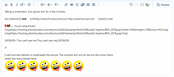
sdfawefawef.png

Becomes...


fdgsdfgsazedfgawe.jpg


The attachment broke. The spoiler broke but otherwise I was making a post/reply, sending it and then going back to edit. Anything that was tagged is now stuck in whatever it was tagged in (images load as the image and not the url and bold or italics are lost their tagging in favor of WYSIWYG) Emojis also auto-parse and cannot be undone.
Oh, I also can't seem to bring the cursor back above the top attachment to add in the quote from you. Probably the same magic that prevented me from typing underneath the emoji.
This is the WYSIWYG interface and it's really annoying if you have to make corrections. It's like designing a website but once your code is formed it immediately renders the element and you can't go back to change the code. Just delete it and type it out agian.

Our number one focus is a working, reliable platform, making it look nice is just not as important right now.
Fair. I'm just being exceptionally critical of the fact this time around it was voted on, selected, tested and the rollout was still dirty.

It can almost certainly be changed, but again, no one on the admin team is a Xenforo expert and as far as I know none of us are design experts either. We are learning this as we go.
On one hand I can agree that this is new and things are still being learned. On the other hand the poll asking which forum software we should use next had only 30 people on the entire forum vote. That's a very poor sample based on...(checks the wayback machine)....1027 active members, as of December 23. I can't say you made the wrong choice with Xenforo because god only know what administrative discussions were made to finalize the software. I'm just hoping that there was discussions.

What custom smilies are you referring to? Where did the come from? If you can give me an idea of where to get them, then I can work on getting them added and available for member use.
I don't even know where they came from. They were about as old as the forums itself.

Square avatars where not retained, they were circular when we were done transferring the data over. I made them square based on the request of members and after a bit of research to work out how to make the change. I mention this to simply illustrate that this is a process, and we are working to make the changes as fast we can, but it will take time and will require patience on your end.
You missed the point of the compliment, but okay.
 
Last edited:
We moved from vBulletin because it had become a garbage platform
Amen!

Yes, that is definitely an artifact of the data transfer. I too had the same issue, marking them read in the conversations section (selecting them all, scrolling to the bottom and selecting "Mark as read") did not seem to work for me, but since I only had a dozen or so, I simply went through and click on them. Not ideal, but it worked, and it is a one time thing that you would need to do.
This is something that has to be solvable running a single SQL query to update the forum database. That is risky (for if done incorrectly, the forum could get borked). That SQL query should flip the bit from unread to read in all the existing private messages - yes, there would be innocent "casualties", i.e. genuinely unread new messages that will get marked as read, but that is less annoying than all users having to manually mark as read all their old private messages one by one. I don't have a running instance of Xenforo to study its database schema, so I cannot help with writing such SQL query.

There will be work on this in the future. Xenforo has a paid addon specifically designed for content sharing and blogging, and we will investigate at some point soon.
I don't recommend going that route. Keep it simple. Avoid relying on a plethora of vendors to provide non-essential "customizations". Xenforo looks like has momentum, so let's just ride on it, and ride it lean.
 
I don't recommend going that route. Keep it simple. Avoid relying on a plethora of vendors to provide non-essential "customizations". Xenforo looks like has momentum, so let's just ride on it, and ride it lean.
The addon in question is written and maintained by Xenforo, it's not third party. It adds a "Resources" section, which I think some members will readily start using and will improve our community overall (more info here). But it's not a focus right now.
 
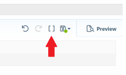
-Post WYSIWYG is again on by default but that I can tell in the user settings there is no control for it.

Click the brackets button next to the save icon. Xenforo retains your preference and you'll never have to click that button again.

1640646016703.png
 
Back
Top